
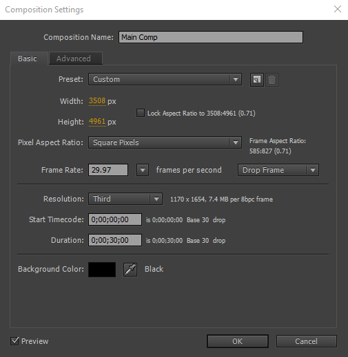
SIZE AND LAYOUT.
Before starting my poster I had to create the size of the poster, most posters are portrait after doing my research and they are fairly big, around A3 size. So in Photoshop I decided to do my poster in A3 portrait with resolution at 300.

First thing I designed was the layout of where everything would go, to do this I started with the credits and the piece of text at the top of the poster. I laid it out to how most movie posters are laid out, with the credits at the bottom and the main image in the centre.

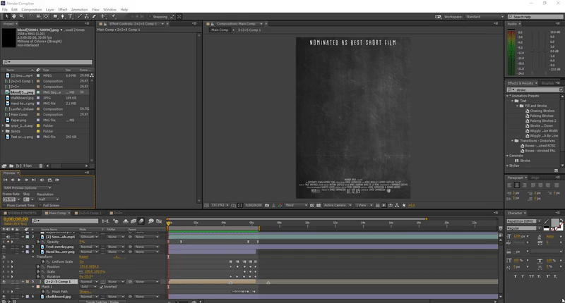
I used the title "Nominated As Best Short Film" as the quote at the top because having a Nomination is a very big accomplishment and when the viewer sees this they know that it is a well made film. I could have put the directors name or an actors name but I put something that would bring the audience in the most.

Using the website 'IMDb' I managed to get the information of all the directors, producers and actors of the film. This helped me put the credits together. When looking at Movie Posters on Google I found that most credits are laid out exactly like this, with the main name bigger than the title or the conjunctions. (The film wasn't made by Warner Bros. but I added it to fill a few spaces.)
Website Link: http://www.imdb.com/title/tt0474522/
Website Link: http://www.imdb.com/title/tt0474522/
Underneath the credits the date is a lot larger than the credits and smaller than the Movie name, they do this because it is the second most important information on a poster, when seeing a movie you want to know when it comes out. So on my poster I made the date of release a bit larger than the credits.
other overlays/parts.
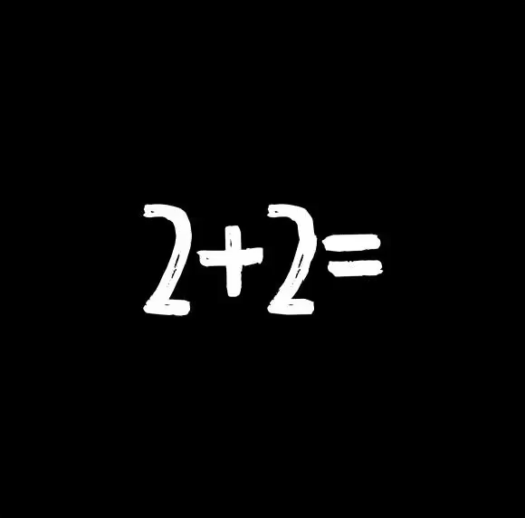
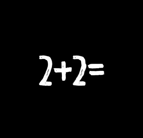
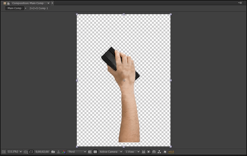
My idea for this Animated Movie Poster is to have the title written out saying '2+2=' then behind that the Number '4' will be written out the same, but will have a dimmer colour. Then I will make it so that blood drips down from the top and merges into a '5' which is over the '4' but underneath the '2+2='. I wanted to make this Movie Poster into a loop as well, I learnt from the GIF's project that when looping a GIF it was so much smoother and the audience would watch it for much longer. So my plan was to have a hand holding a chalk board eraser and wiping away the blood and the chalk text. Unfortunately I didn't have a chalk eraser otherwise I would have taken a picture of my hand holding it. Instead I got a picture off the internet but the only HD ones were copyright, but that didn't matter too much because when putting it together I would add a motion blur on the top so that it would be hard to see it very well.
|
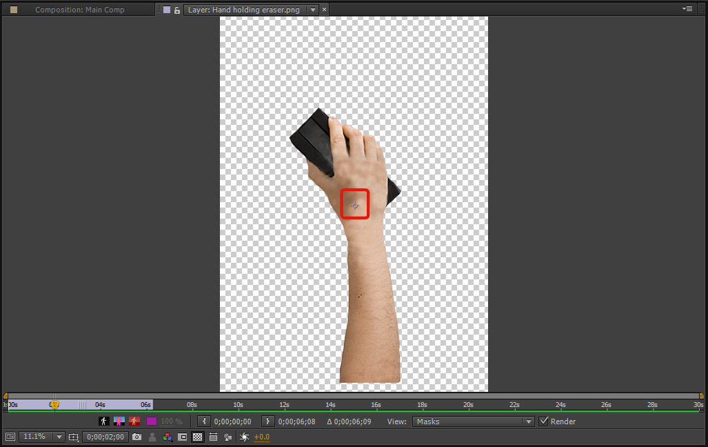
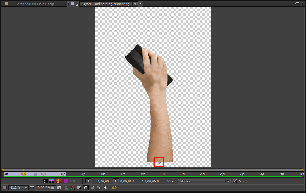
After putting the image into Photoshop I wanted to mask around it and remove the white background. So I used the pen tool to draw around the hand.
|

|


|
After removing the background I used the Clone Stamp tool to remove the watermarks on the top of the image, I did this so that when the motion blur is put on the top I don't want that standing out in the picture, the spiral part of the watermark would stand out a lot and people would see the water mark.
|

|

BLOOD '5'.
I then created an A3 sheet with resolution at 300 and opened up the Timeline windows which then appeared at the bottom of Photoshop.

|

|
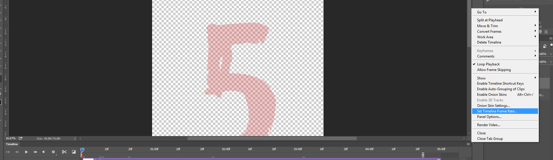
After opening up the Timeline, I wanted to make sure that the Timeline was set at 30 Frames Per Second. Usually at default the Timeline is set at 30Fps but I wanted to be sure. Reason I am setting it at 30 is because it would take too long to do each frame if I did 60fps, and if I did it at 15 fps it would be too jittery. So 30Fps is the right length for this blood animation. After seeing the Fps, I need to add a Duplication action, I could always go to 'Layer - Video Layer - Duplicate Layer'. But setting an action was save much more time.
Creating the Duplicate action.
Before creating this action you need to make a separate video layer and draw a line on the page. Otherwise when you do this action there won't be anything to duplicate and you won't be able to duplicate.


|

|

|

|
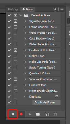
After opening the action tool, I clicked on 'Create New Action' which was the piece of paper icon next to the folder icon at the bottom of the Actions window.
I want to name the action 'Duplicate' and set the Function Key to 'F9', after creating this Action it will start recording your motion. You then want to go to [Layer - Video Layers - Duplicate Frame] this will then duplicate your frame to the next frame over, to prevent your action recording other clicks you then want to stop the recording. |

|
|
I then deleted the Layer and created a new one to get rid of that line in the middle of the page.
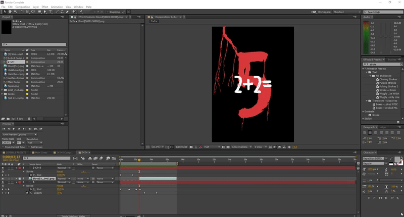
I wrote the number '5' in the middle of the page as a reference to where I want the 5 to be. I used the font "Repetition DEMO Regular" I then changed the opacity to 40% so that its not on the way of the drawing.

|

|
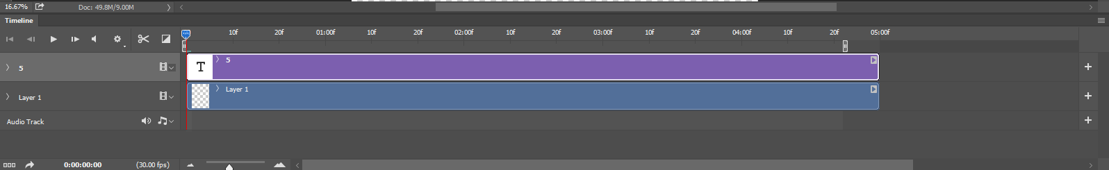
This is what it looks like in my time line, I then started drawing on the Layer 1 and after drawing the first Frame I would duplicate the frame so that I wouldn't have to draw the whole thing again, I could just add to the drawing.
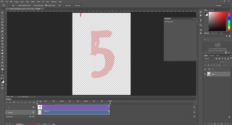
I started at the top of the page and made it so it dripped down diagonally into the Top Left of the 5. I then added more blood streams going down the main blood stream to give it a better effect and to give it a more liquid effect.
When I reached the 5 I had to draw around the 5 without drawing over the lines of the 5. So how I did this was to HOLD down CTRL and click on the 'T' next to the 5 on the layers panel, this would create a mask all around the '5' so that I couldn't draw around the edges.

|

|
After doing this over and over again for 3 seconds/90 Frames. It turned out like shown below.
I had to render this as a PNG, instead of rendering it out as a GIF I rendered it out as multiple screenshots. I first hand to open up the Render Video window, that was located under [File - Export- Render Video...] after opening the window I made a new Folder so that all the screenshots would be in one place. I made it a 'Photoshop Image Sequence', 'PNG' Frame rate at '30fps', the range ticked at 'Work Area' and under render options I chose the Alpha Channel as 'Straight - Unmatted', this made it so it wouldn't render out a background.

|

|
AFTER EFFECTS.
After making all the separate parts in Photoshop, I then moved them all over into After Effects. I made the Composition the same as the Photoshop sheets, which is A3 portrait (3506x4961px).
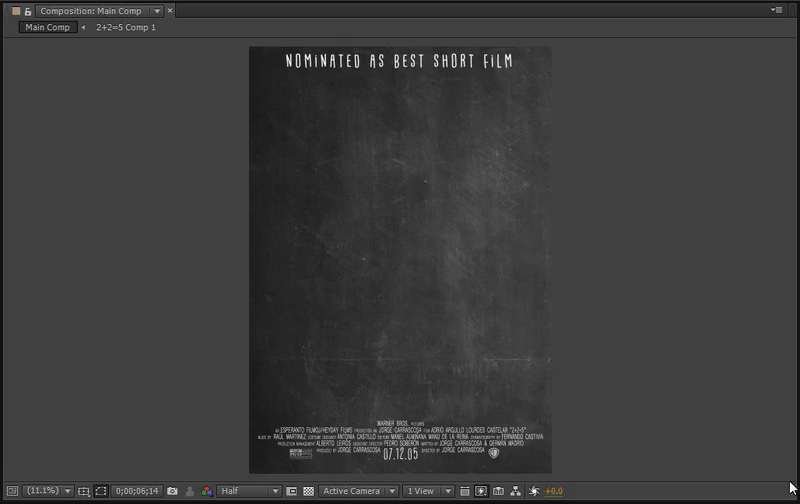
I found a chalk board image online which was HD and used that as my background for the overlays. I did two different designs, one with the Chalk Board and one with a Note Book page.

|

|
In the composition I put the Overlay with the credits on and the chalk board inside, after this I made a new composition and called this '2+2=' this comp is for the title animation.

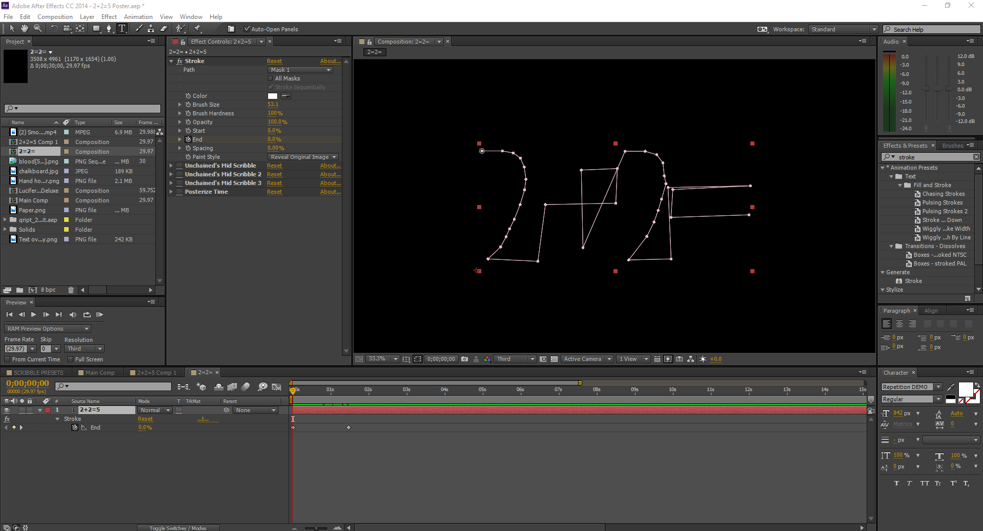
The 2+2= composition is for where I will be creating the animated text, first bit that appears is the '2+2=' part which I wrote out using the same font as the blood '5'. (Repetition DEMO Regular)
After creating the text I got the mask tool and masked how I would write '2+2=' this will help when I add the Stroke effect later on.
After creating the text I got the mask tool and masked how I would write '2+2=' this will help when I add the Stroke effect later on.

MASK TOOL


After creating the mask I got the 'Stroke' effect from the Effects & Presents tab on the right. I changed the Path to 'Mask 1' which is the mask we just made for the '2+2=' I then changed the brush size to fit over the text which. I then changed the 'Start and End' to 0% but key framed the End. I also changed the Paint Style to 'Reveal Original Image'.
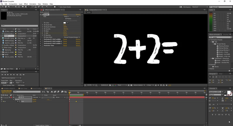
The text should have disappeared. After key framing the 'End' of the stroke effect to the beginning of the composition (0 seconds) I moved 00;01;05 and changed the 'End' to 100%. After this was done you can see that the text was being written out.
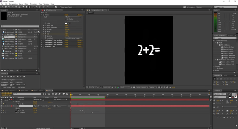
After doing the '2+2=' I did the same effect with the 4 but made changed the colour of the text to a light grey and changed opacity to 75%. Also straight after the effect was done I made the opacity go from 75% to 0%. So that when the blood 5 went over the top the 4 would disappear and not make the poster too untidy.
I added another effect on the top of both of these layers and its a little wiggle effect, it doesn't effect the look too much but it gives it a nice motion effect and looks a lot better than a still piece of text. I used 'Turbulent Displacement' on the top 3 times, the reason I used this effect 3 times is because if you use it once the wiggle will act in one direction, if you add a couple more the wiggle effect will act in different directions, I also added a 'Posterize Time' effect on the top, this would change the FPS of the effect, so instead of it being really smooth wiggle, it would be jittery, so I set the frame rate of the effect to 10fps.

Without Jitter/Effects.
|
With Jitter/Effects.
|
The last thing to add is the 'Blood 5' which we made in Photoshop. I dragged it into the composition but I didn't want it starting at the beginning I wanted it to start just as the 4 was drawn out. I then pressed 'CTRL - ALT - T' to open up the Time Remapping. I changed the speed of the layer so that it was a little slower in drips. When key framing the speed I then Easy Eased them key frames to make them turn into a smooth key frame. Pressing F9 on the key frame will turn them into an easy ease key.
Without Easy Ease
|
With Easy Ease
|


FINAL EDIT.
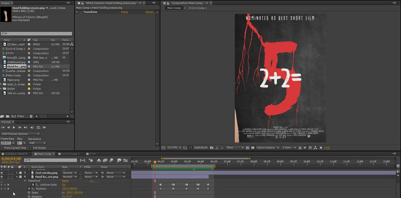
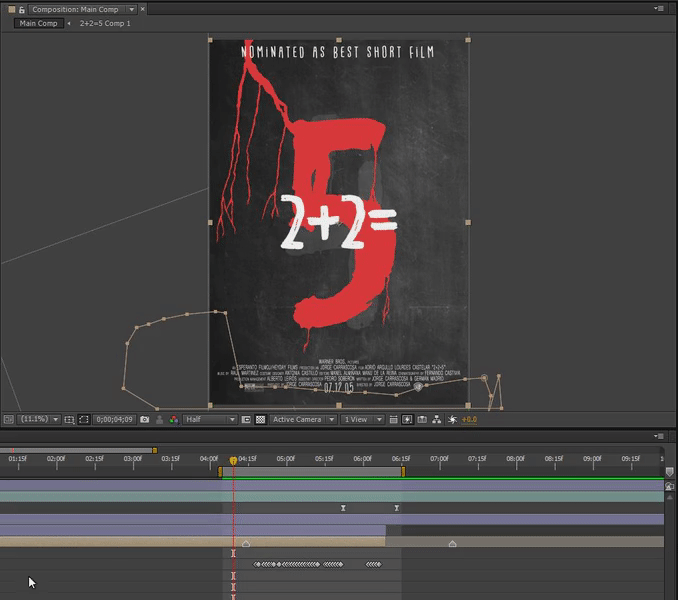
I then added the '2+2= Composition' into the Main Comp, this showed the drawing with the background and the credits, but I hadn't put in any effects on the top and I didn't edit the hand part yet.
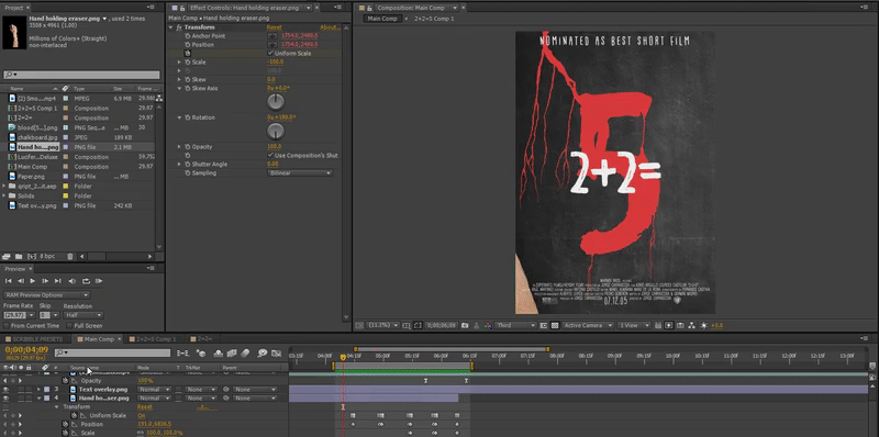
I put the hand that I modified into After Effects and put it into the composition. When putting it straight into the comp I saw that the centre rotation point was in the centre. My aim for this hand was to make it swipe left, right, left, right and brush away the title of the movie, for this to happen I needed the rotation point to be where the elbow would be. Its like moving your arm, your arms doesn't rotate at the wrist, it rotates at the joints, which is the elbow. To do this I double click on the layer and it opened up the Layer window. The layer window is used to modify a single layer, only one layer can be shown in this window.
I then moved the centre rotation point a bit lower.
I then moved the centre rotation point a bit lower.

|
DEFAULT ROTATION POINT
|
ROTATION POINT AT ELBOW
|
I added a 'Position, Scale, Rotation and a Flip + Flop effect' onto the layer, these different options will help me move the hand how I want it.
I first changed the position, I key framed each time to where I wanted the hand to be. I started with the position tool because its the most important, it helps you with timing and helps with knowing how fast the hand should go.
I first changed the position, I key framed each time to where I wanted the hand to be. I started with the position tool because its the most important, it helps you with timing and helps with knowing how fast the hand should go.

I then worked with the 'Scale'. The hand was a little too small to reach from one end of the page to the other, if I didn't change the scale then there would have been a floating hand. Instead what I did was make it so that the hand grew in size towards the end.
Last thing I changed was the 'Rotation' to give it a more flowing motion, a smoother motion. I also 'Flipped' the image using the Transform effect that I placed on the image. I key framed each time the hand went off the screen then flipped the image to give it even more of a smoother motion. Also when you do this motion yourself your wrist will also rotate. A good thing to do when editing something is to do it for real and you get a perfect perspective of what the motion is.
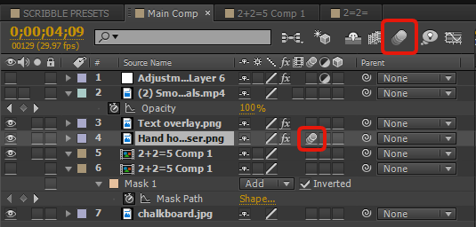
A few things were missing in this as well, one of the things that is missing is the 'Motion Blur'. So to turn on the motion blur you click on the layer and click the motion blur icon on the layer, if it still doesn't appear you need to enable motion blur on the comp as well which is just above it. If you don't see these options then you can click on 'Toggle Switches/ Modes' at the bottom.
|

|
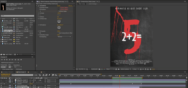
Last thing to do was to remove the Title as the hand erased the numbers. I used the 'Mask Tool' to do this, I went frame by frame moving each mask point so that it looked like the eraser was removing the numbers. This wasn't too hard to do because it was basically a straight line when masking. I also added a 'Mask Feather of 40 pixels' so that it wasn't just a sharp line, I wanted it to have a little smudge effect on it. As I move along the timeline you can see the the mask moving. All the dots at the bottom of the screen are the key frames of where I changed a position of a mask each frame.
OVERLAYS.
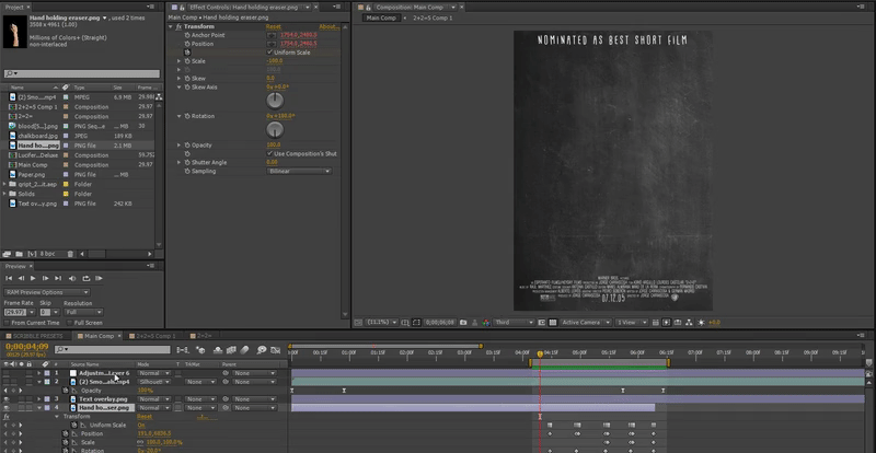
I added two Overlay effects on the top of the poster. The first overlay was a smoke effect, with the smoke effect I changed the layer style to 'Silhouette Luma' and changed the opacity of the layer from 0 at the start and end to 100% so that when it looped the smoke didn't lag.

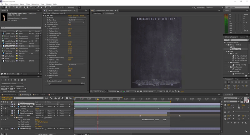
After adding the smoke effect, I added a Colour Correction on the top. Instead of using a Levels or Curves, I used a Universal 2.0 Plug In called 'VHS'. VHS effect has lots of different options and it makes your video look fairly old, makes it look like its been played on a VHS tape. The settings I used for this plug-in are shown down below.

TO SEE THE FINAL RENDERS CLICK THE BUTTON BELOW
