
CREATION OF MY ZINE.
Before designing my zine, I first had to take photos of buildings to fully understand the different types of buildings in Hastings. There are two sides of Hastings, the new town and the old town both sides of Hastings have completely different buildings from each other which is great for my research.
Hastings is very into fishing, so along the beaches are lots of fishing boats and chip shops, I didn’t want to just take photos of buildings I also wanted to take photos of the boats as well.
I had no aim on what to take photos of, I just went out and took photos of the buildings and boats that I liked, I wish I captured a lot more buildings in Hastings, but I can also do that in the future to add to my blog.
Left Side of Hastings is Modern Side, Right Side of Hastings is the Old Side.

|

|
I put together a contact sheet to show all the photos I took, there are a few photos that stand out from others that I will probably use in my Zine.

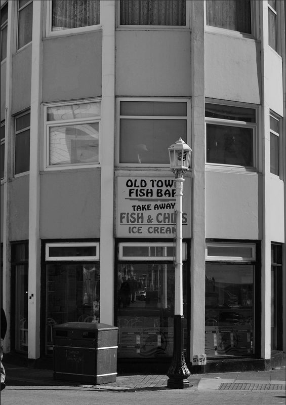
This was one of the first photos I took, the reason I love this photo so much is because of how the building looks, the way it curves around, it’s a very symmetric building. The way it curves too makes each side have a different shade of light, you can tell where the sun is because of the way it curves.
The one thing I dislike about the photo is the lamp post being in front of the building and getting in the way of the text, if it was directly in the centre I may have been okay with it. Another thing I like about this photo is the sign on the front of the building, I had an idea of turning this whole photo into black and white but leaving the colour of the “Old Town Fish bar” and “Fish & Chips - Ice Cream” text. Doing that would lour people into looking at the centre of the image, because the centre would have the colour.

I took this photo in the alleyways of Hastings and the reason I love this photo is because of the sign that hangs down saying “Dirty Old Town”. I wanted to incorporate Typography into my Zine as well because I think it fits very well with buildings, for example you will see text outside of a shop, chip shop or museum.
When walking along the street I decided to look up at some apartment blocks above some shops, I took the photo and I thought it gave a different perspective of the building from the other photos. Another reason this photo stands out more than the other photos is that the building and the sky cut the page in half perfectly.
|
But linking back to the research I did on Zines, I looked at Zines that have been cut out and shaped differently, instead of just having a normal rectangle piece of paper. So instead of replacing the sky with a pattern of some sort, I was going to cut out the sky part leaving just the building and on the page before and after I would have a design. This would add a more unique look to my zine and shows that I have experimented with different pages. |
|
Experiment.
I didn’t just experiment with cutting out, I also experimented with folding, I tried landscape folds and portrait folds. After going
through my photos, the photos that I will use the most are portrait so I will be using a portrait book to create my zine.
I didn’t like the one sheet folds that much, I preferred the technique where you put sheets on top of each other then staple
them together, just like a booklet.
FINAL ZINE EDITS.
Page Size and Settings

FIRST PAGE
I experimented a lot for the first page and a lot of different styles didn't work. I was playing around with the colour a lot and trying to create a front page where Black and White and Colour could link up to create something. The reason I wanted to have black and white and colour in the picture is to make the colour part stand out more.
First thing I did was find an image that I thought was suitable for the front page. There were a couple of photos that I liked but I wanted a symmetric photo so that the page looked very even.
Photos I may have used for the front cover.

Photo used for the front page.
After putting the image into Photoshop I put a Black and White filter on the top. Because the sun is shining on the different sides of the building I had to change the black and white filter a bit to make it look right for the picture.

Without changes. The black and white wasn't evened out and was too dark on the left side, making the image not as symmetric.
|
With changes. The black and white is evened out and looks a lot more symmetric.
|
I tried many different things with the front page like making the sign text colour and leaving the rest of the photo black and white. I was also trying to remove the lamppost to show more of the sign.
In the end I decided to keep the whole picture Black and White and make the front page text coloured with the background.
In the end I decided to keep the whole picture Black and White and make the front page text coloured with the background.
I stuck to keeping the whole image Black and White. I then added the front page text and tried it in just White but it didn't pop out well enough and have a good enough look to it. So what I did was copy the normal background photo and place it above the text and created a clipping mask, making the background photo mask over the text.

|

|
The text was not noticeable after doing this so I had to add some Overlay effects on top of the text to make it stand out. I put the white text underneath the photo text and first changed the overlay effects for the white text. I added a stroke and a drop shadow to the image. The drop shadow was very smooth and gave the text distance from the photo. I added a white stroke around the text to make it stand out from the black and white photo. If I added a black stroke it would have merged into the black and white photo.

|

|
I then added an inner shadow to the photo text layer. This made the text layer stand out a lot more.


White Text Layer with Overlay Effects
|

Photo Text Layer without Overlay Effects
|

Photo Text Layer with Overlay Effects
|
After adding the front page text such as my name and the title, I added one extra detail which was a boarder around the side of the A5 piece of paper. This was more for looks and to add a little bit of colour into the image. It also made you focus more into the centre of the page to read the title. I first made it so that there was a white boarder around the edge of the photograph but it fels to squished and didn't look great for a Zine.

White Boarder
|

Without a Boarder
|

With Thin Blue Boarder
|
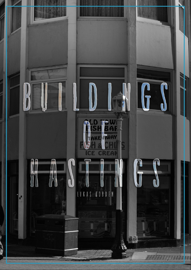
FINAL IMAGE FOR FRONT COVER
PAGE 4 AND 5
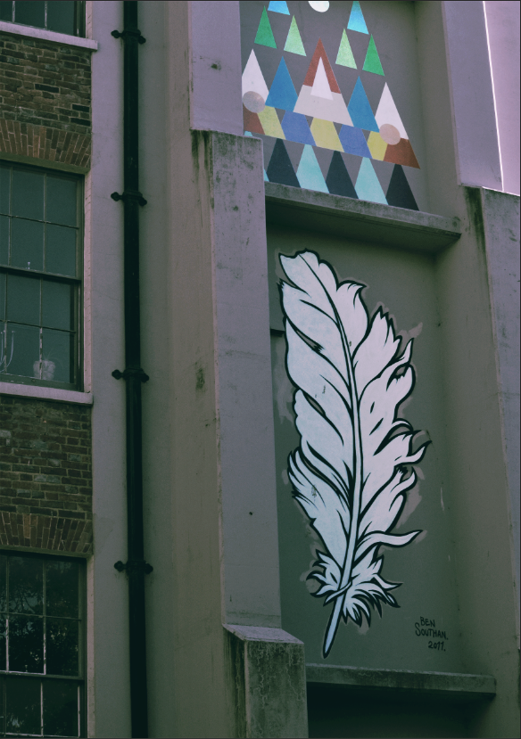
I really like these 2 pages because the graffiti stands out a lot and looks amazing when combining the feather and the triangles together.
On the first page I wanted to show what I was referencing to for the second page which would be the images in the photograph combined together. My idea was to put the triangles as a background and the feather displayed infront of the triangles. I did this because the feather stands out a lot more.
Another reason I like the graffiti in the photo is because of the triangle shapes, they give the photo an 80s look because of the colours.
|
|
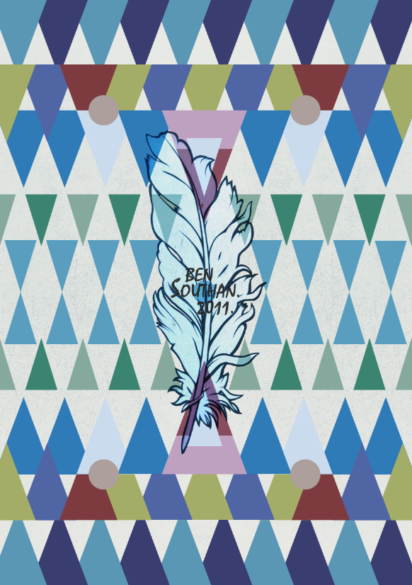
I first masked around the feather and removed the background. I then created lots of different triangles to create a similar pattern as the graffiti but added more triangles to fit the A5 paper. I placed the feather directly in the middle of the paper and changed the Layer type to 'Overlay' to merge the feather and the triangles together. The writing in the middle is the same as the text in the photograph but I used a font called 'Mistral Regular'.
PAGE 6
Page 6 is my favourite page in the Zine because it is one of the most 80s looking pages. I used a lot of different patterns to create this page. I wanted to make the zine look very colourful so that it was very 80s like and to make the Zine more alive.

I was experimenting with different ways of taking photos of buildings. There is a normal way by just looking at the building and taking the photo and everyone can see that the photo is a building, but I wanted to make the photo more surreal and to make it look less like a building. The best way I found to do this, was to take the photo at an angle that people wouldn't usually view a building at. So I took a few photos looking up at the side of the building and I captured some very unusual photos.
Experimenting Photos
What I did first was create a pattern background, then masked around the building to remove the sky. I then duplicated the layer and made different Colour Overlays and rotated each duplicated layer slightly.

|

|
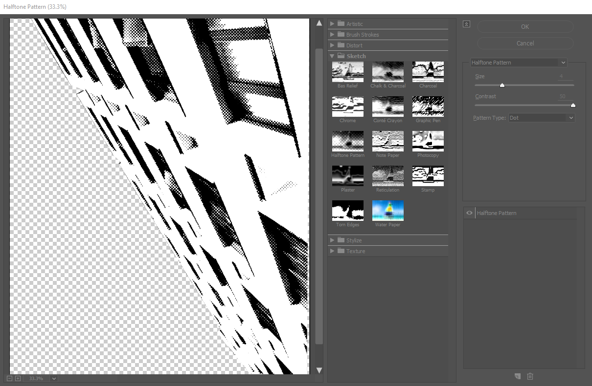
I then created another building layer to create a halftone effect for the building. This is to cover up the red a bit because it stands out too much and is too bright. I first added a pink background of the building mask then go the same layer without the pink colour overlay and changed the 'Layer Overlay' and 'Opacity'.


|


|
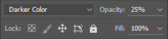
After looking at the page the building didn't look bright enough and stand out as much as the background does. I wanted to keep the halftone look but also have it stand out more. So I duplicated the last halftone layer and changed the Layer Overlay to 'Darker Color' and changed the Opacity to 25%. I also changed the halftone effect so that the circles were a lot larger.
|

|
To give it more of an 80s themed look I added a couple patterns on top of the building layer.

Last piece was adding text to the bottom left of the page saying 'Look Up'. I could have left this out and it would have looked fine but I wanted to add a bit of text to the image. I used the font 'Back to Black Bold Demo Regular' and added a drop shadow as well as a masked overlay of a pattern over the top of the text.

I used very similar steps to when creating the other pages. Masked around all the buildings and used patterns as the background and tried using very bright images to make each page stand out and want to be looked at.
